PUMA Design System Visualisation
UX/UI
Project Overview
Objective
This project involved creating a visualisation that illustrates what a design system is, its importance, and its impact on PUMA as a business. The goal was to present this in a way that is accessible to employees across the organisation, including those in non-technical departments.
Info
Team: Sole UX Designer & Researcher
Duration: One Month
Tools: Figma, Excel
Type: PUMA (as part of an internship)
Goals
- Collect and analyse meaningful data showing the design system's impact
- Shape the findings into a compelling, business-focused narrative
- Communicate the concept of a design system in a way that is clear, relatable, and engaging for non-designers
Challenges
- Explaining an industry-specific concept to a diverse audience with varying levels of design knowledge
- Gathering measurable, reliable data that demonstrates tangible business impact
- Crafting a data-driven story that flows logically and resonates across different teams
01 - Discover
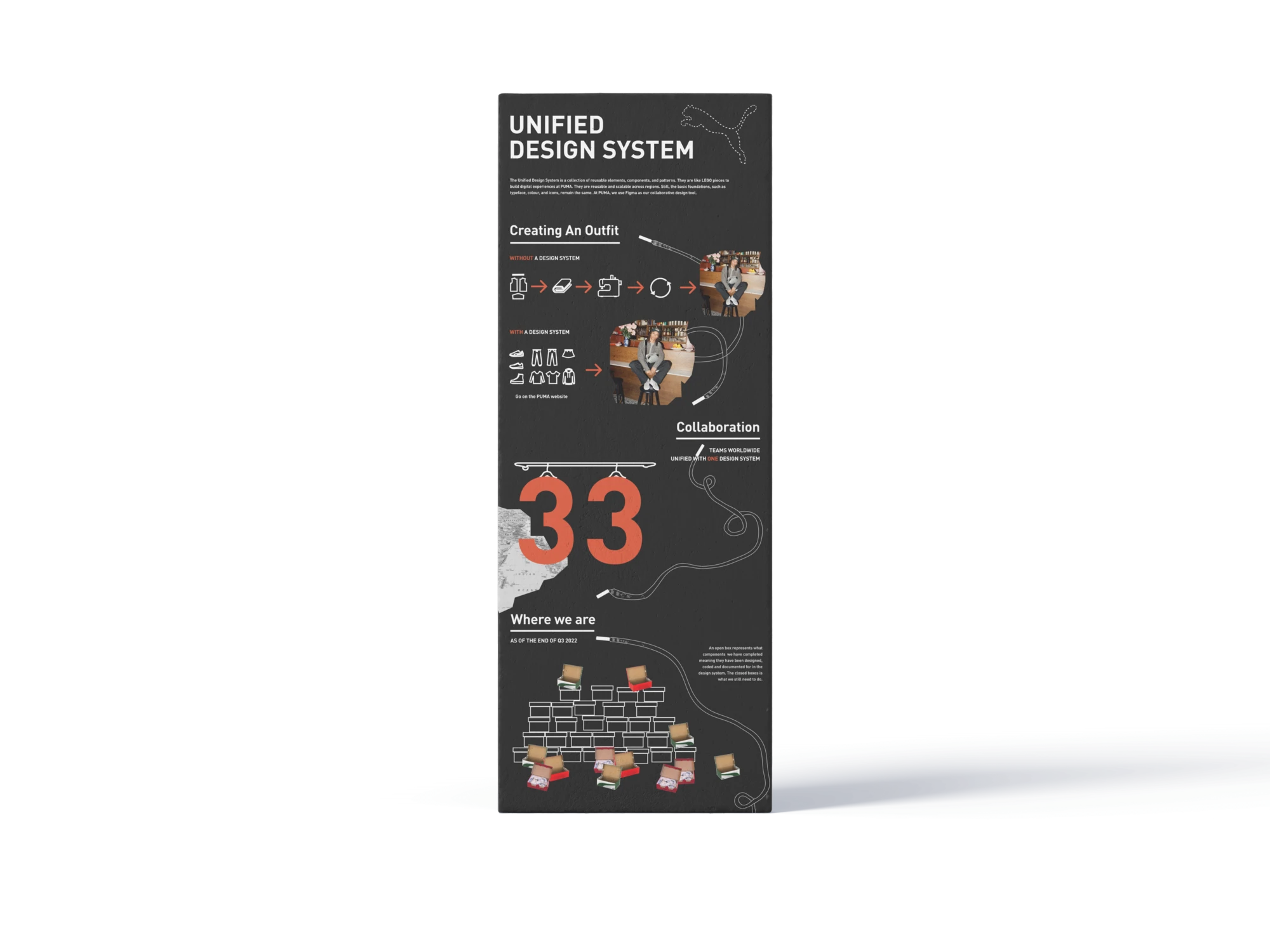
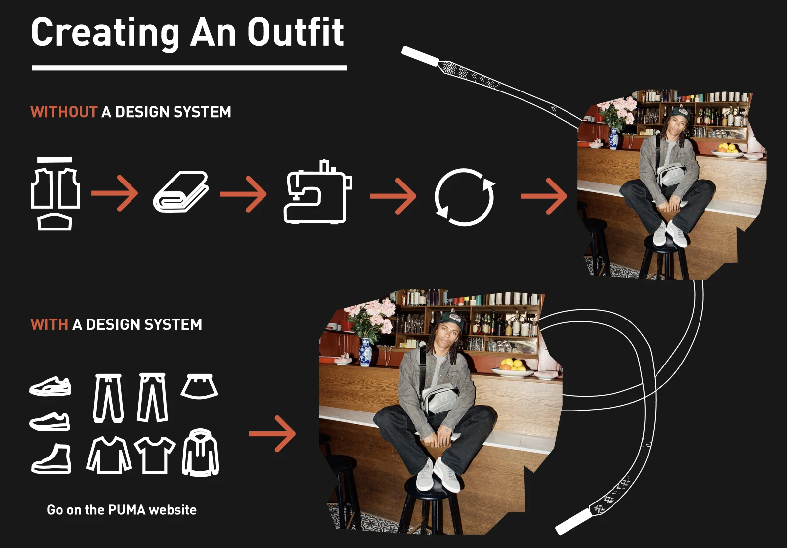
Puma's design system had been live for just over a year, yet its impact wasn't fully understood outside design and tech. The challenge was to create a visualisation that clearly showed its business value to a broad, non-technical audience.
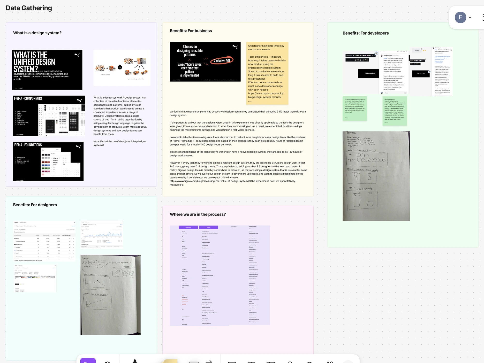
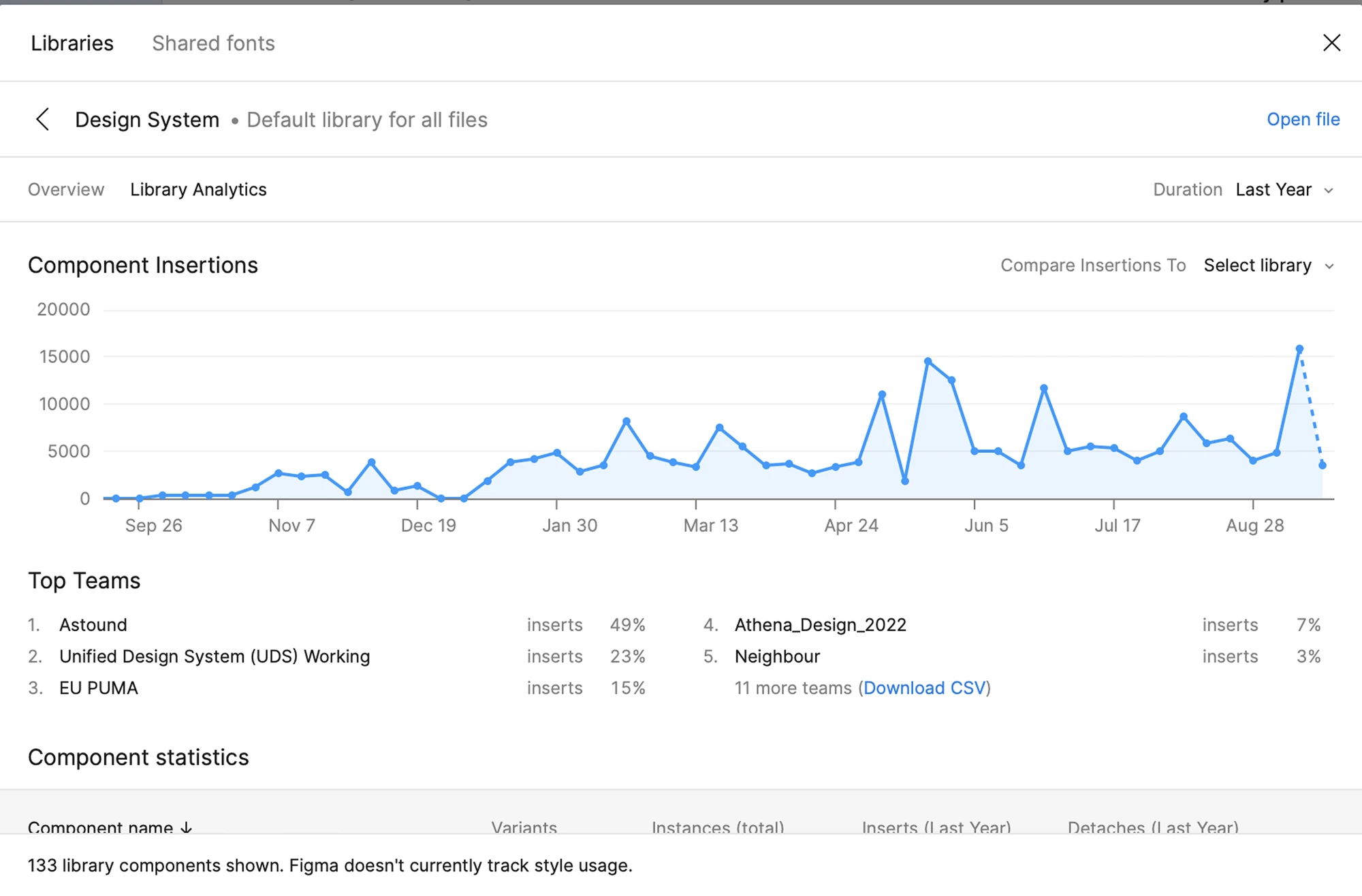
I analysed Figma analytics, scraped documentation data, and spoke with designers and developers to uncover trends. The results were striking: 33 regional teams had been unified under one design system, and uptake was steadily increasing, as shown in the growing number of component inserts in Figma. Industry research confirmed similar benefits of greater product consistency, lower design and engineering debt, improved quality, and better team communication.
02 - Define
The core question became:
“How can we use real data to prove the design system’s value and secure continued investment?”
From my research, I identified three main goals:
- Collect meaningful, measurable data on design system adoption
- Organise this data into a compelling narrative that demonstrated business impact
- Explain the concept of a design system in a way that was tangible for people with no design background
The main challenge was translating technical, design-specific insights into an engaging narrative for all employees.
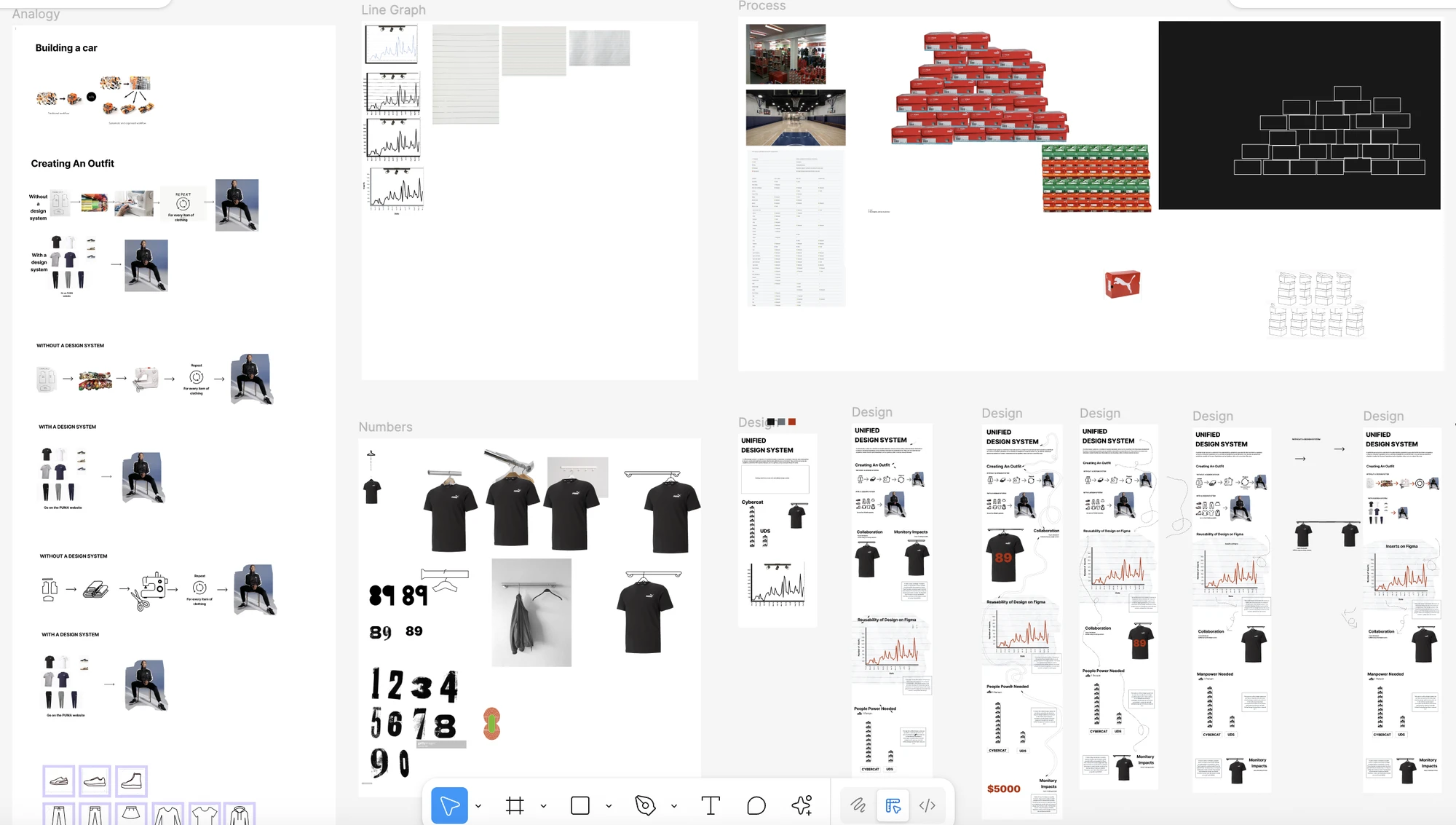
03 - Develop
I prioritised the most compelling data points: a $5,000 saving from reusing a single button, rising insert counts across 12 months, and the scale of global adoption. These metrics formed the backbone of a clear journey, from “what is a design system” to “why it matters for Puma’ bottom line.”
I explored multiple infographic styles, weaving in familiar e-commerce motifs for relatability. Through iterative feedback, I refined layouts to balance simplicity for non-designers with the precision needed to convince decision-makers.
04 - Deliver
The final deliverable was a polished, presentation-ready visualisation that demonstrated the positive impact of Puma’s design system on efficiency, cost savings, and quality. It was accessible for audiences with little or no design knowledge and could be used in meetings, presentations, or informal conversations. By combining simple explanations with concrete data, the visualisation helped stakeholders understand not only what the design system is, but why it’s a valuable business asset.
05 - Reflection
The visualisation successfully communicated the value of the design system, helping employees across Puma understand its role and benefits. It became a conversation starter, sparking cross-team discussions and increasing awareness. Success was measured through audience engagement, follow-up questions, and how well viewers could summarise the key points afterwards.
This project reinforced the importance of storytelling with data, adapting technical language for diverse audiences, and refining through iteration. Moving forward, improvements could include gathering feedback on its long-term impact and exploring interactive or animated formats to make the story even more engaging.